This post is old and probably irrelevant today.
17 July 2019
Conditional formatting in Google Data Studio tables
In Data Studio, it's easy to improve your table charts readability by adding a column with a visual icon indicator.
Update in December 2019
When we wrote this article, Google did not have a conditional formatting feature. They have since added it.
You can still use the technique described in this article as an alternative or complement to the official conditional formatting feature. The conditional icons will also work when combined with conditional background colors.
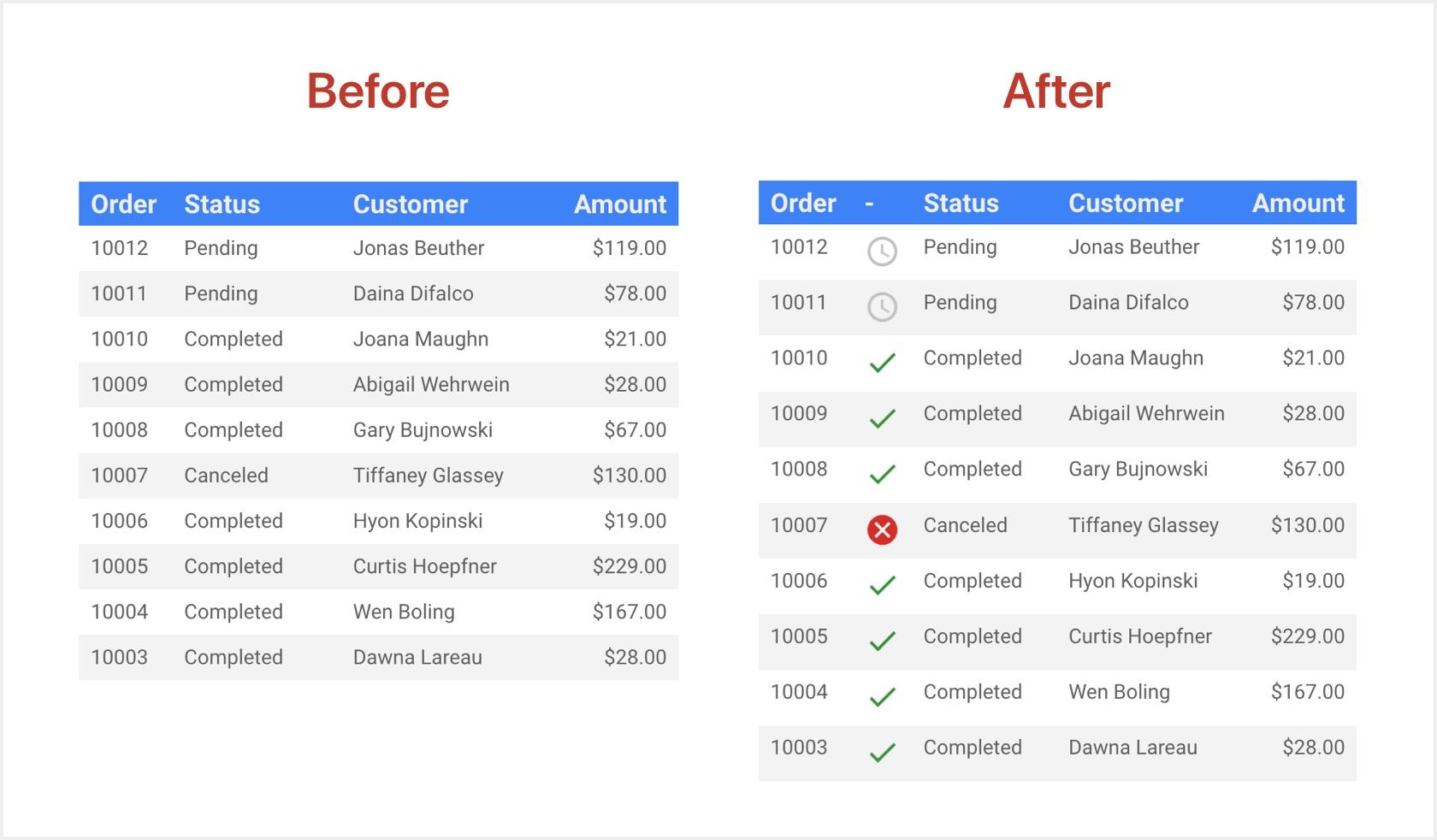
As we saw previously, you can add images to tables. We will use the same technique to compose the urls of the icons depending on the value of a field.
Further down on this page, we give you 5 more examples: up/down arrow, star, rating, customer satisfaction, and error/warning.
Step 1: Decide where to host your icons
Our solution uses colorful icons. To display these icons in your reports, the corresponding images need to be accessible somewhere on the Internet.
![]()
You can either:
1- Link directly to our images, available here:
https://gds.baguette.engineering/icons/
Example:
https://gds.baguette.engineering/icons/check_circle.png
2- Host these images yourself, after downloading them here:
https://github.com/BaguetteEngineering/gds
Example:
https://example.com/icons/check_circle.png
These icons:
- Are from this official icon set from Google, which is free to use and modify.
- Are available under Apache license version 2.0.
- Use colors from Google's Material Design guidelines.
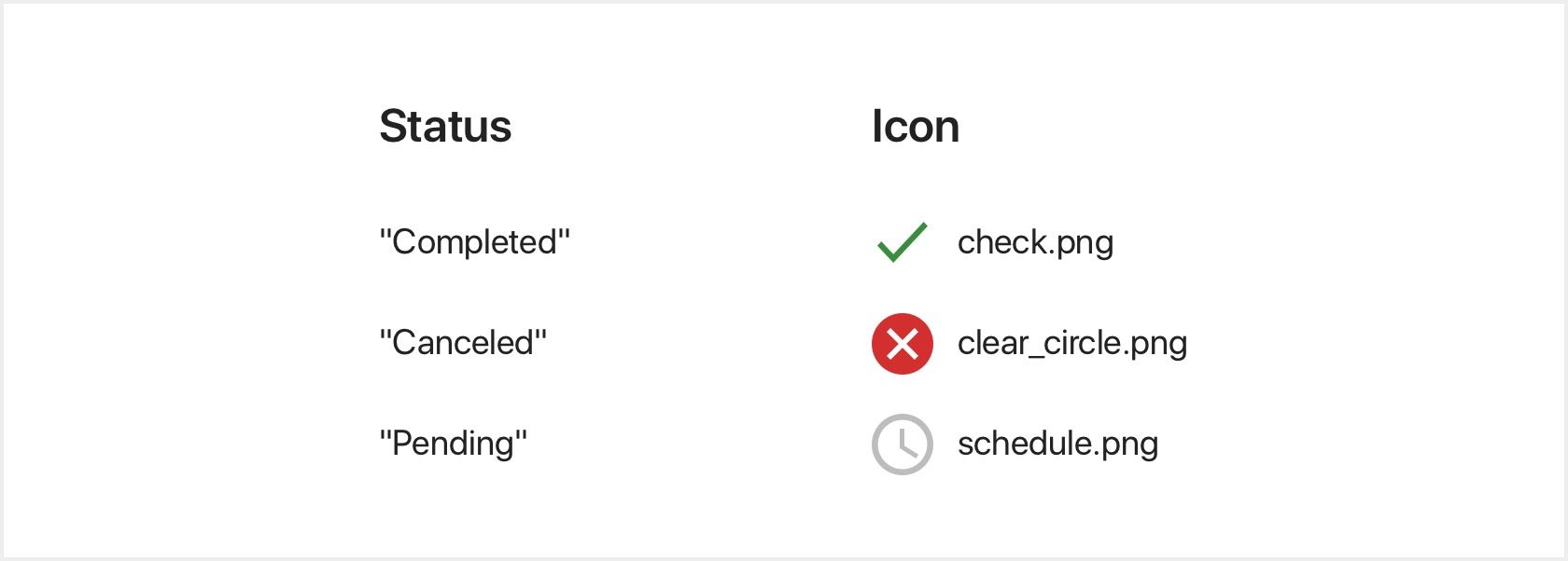
Step 2: Choose your formatting
Decide which icon to use. In this first example, we want one icon for each possible value of a 'Status' field associated to an order:
Step 3: Create your condition
Create a new calculated field on your data source. Give it a name, then write a formula like this one:
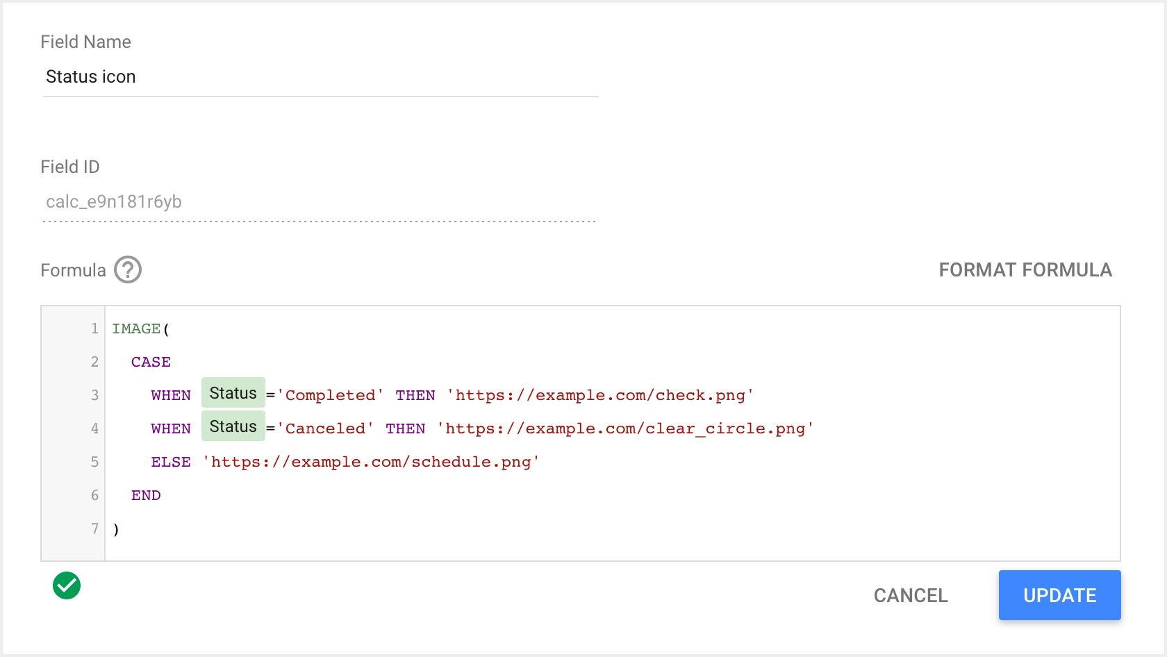
Replace https://example.com with the address decided in Step 1.
It uses 2 functions:
1- IMAGE, to create an image field.
2- CASE, to create the conditional logic needed to choose the right icon depending on the value of 'Status'.
Step 4: Add the column to your table
Add the new country flag image field to your table chart as a dimension:
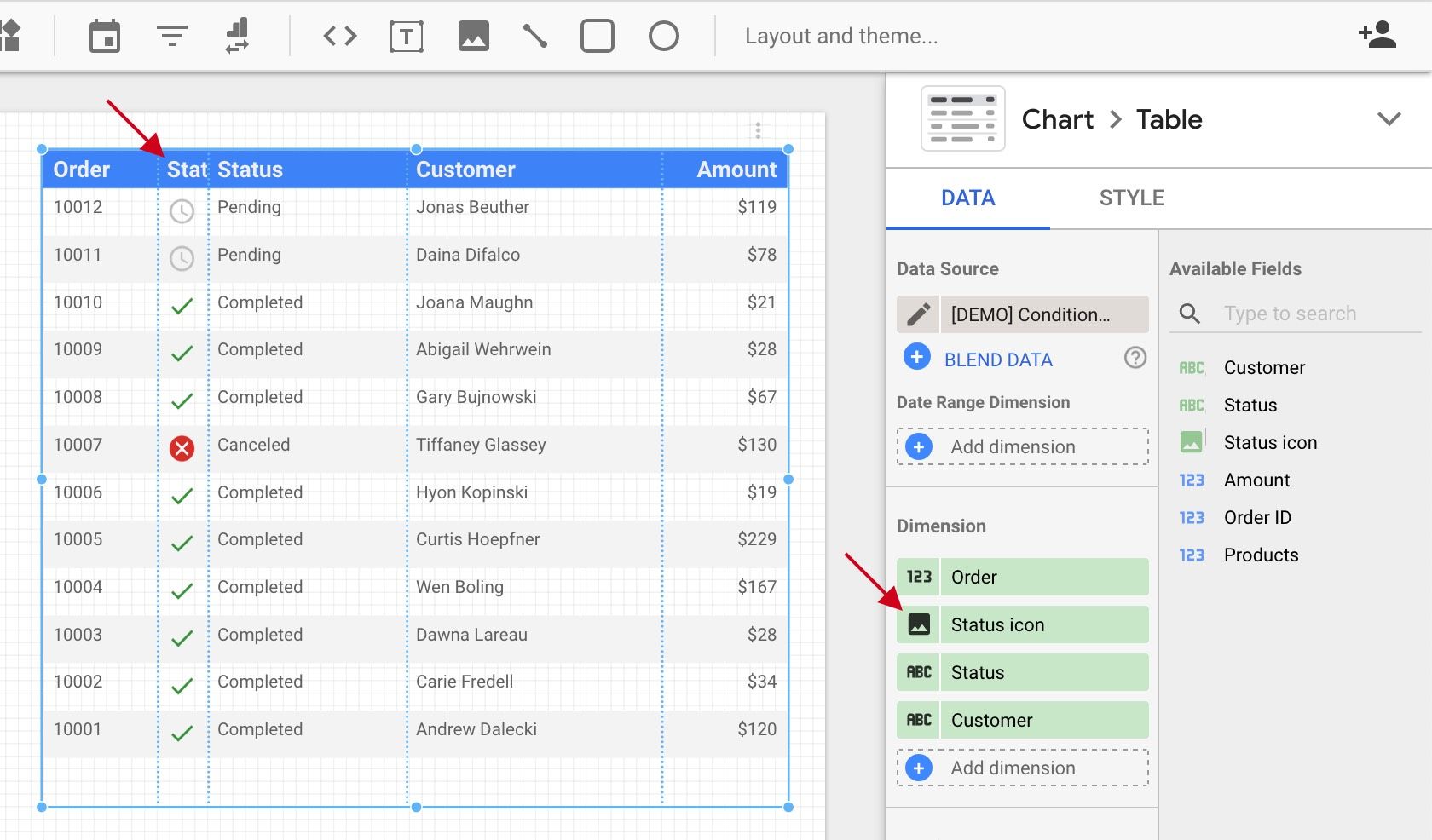
Resize the column to adjust the icon size, and you're done!
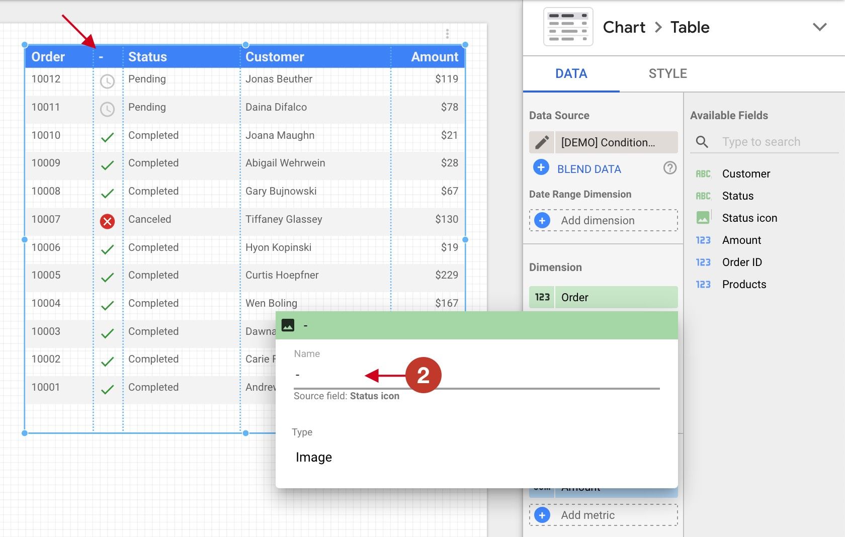
You may want to hide the column header, as it will mostly be truncated anyway. To do so, click the image icon (1):
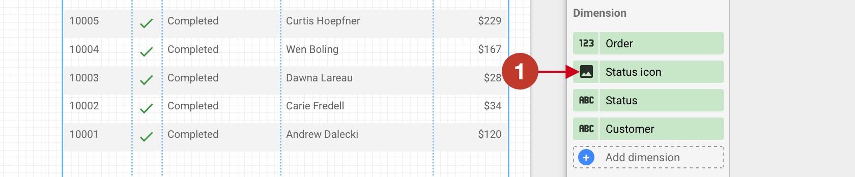
And set the name as '-' (2):
Here are 5 other examples:
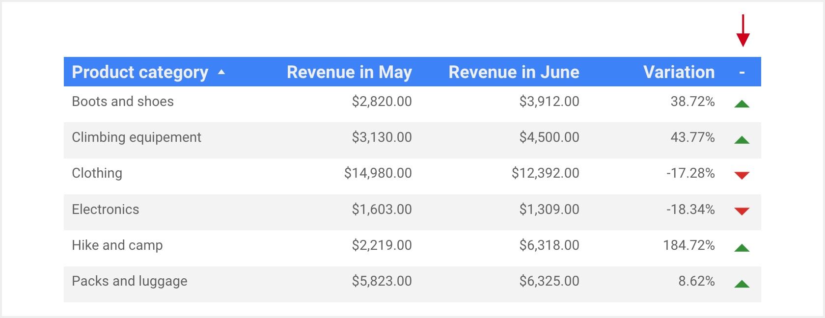
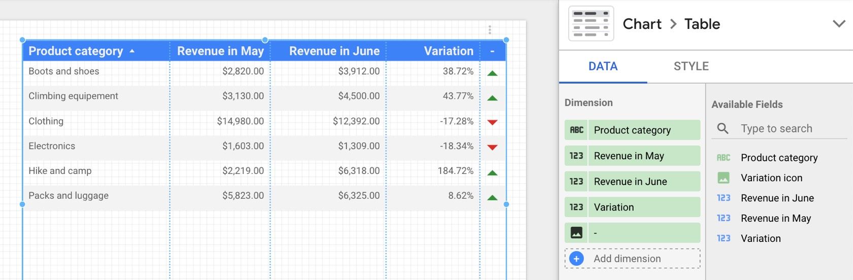
Example 1: Up / down arrow
Using arrows to highlight a positive or negative evolution in revenue:
![]()
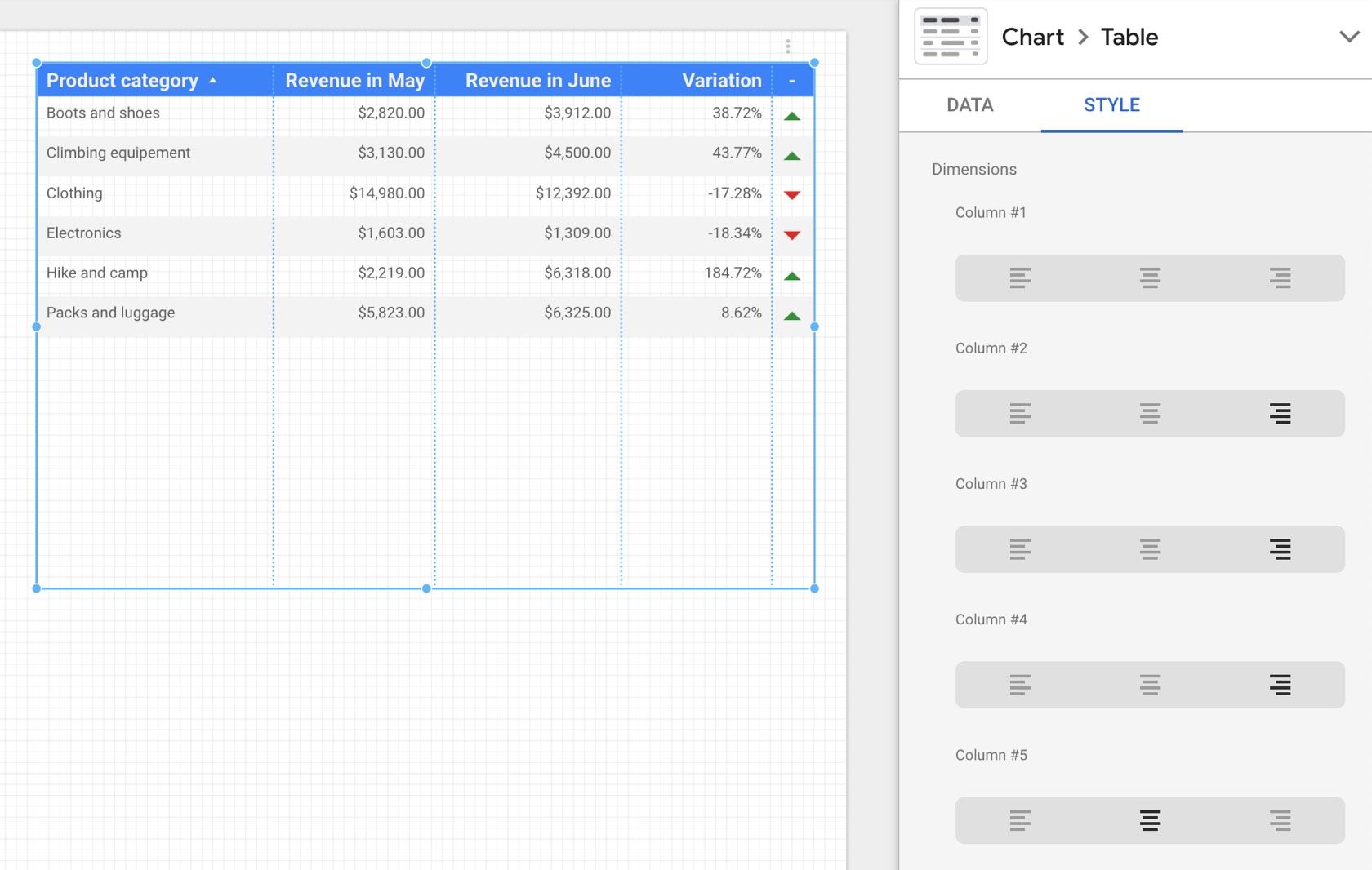
If you're wondering how the columns can be in this order, read this note.
Field: 'Variation' is a Percent field. It contains values like: 0.3872, 0.4377, -0.1728 ...
Icons: arrow_drop_up, arrow_drop_up, transparent.
Condition:
IMAGE(
  CASE
    WHEN Variation > 0 THEN 'https://example.com/arrow_drop_up.png'
    WHEN Variation < 0 THEN 'https://example.com/arrow_drop_down.png'
    ELSE 'https://example.com/transparent.png'
  END
)
Replace https://example.com with the address decided in Step 1.
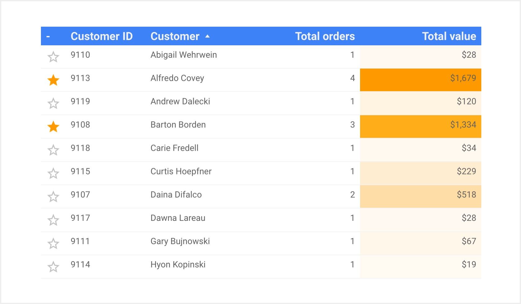
Example 2: Star
Using a star to indicate which customers have spent more than $1,000:
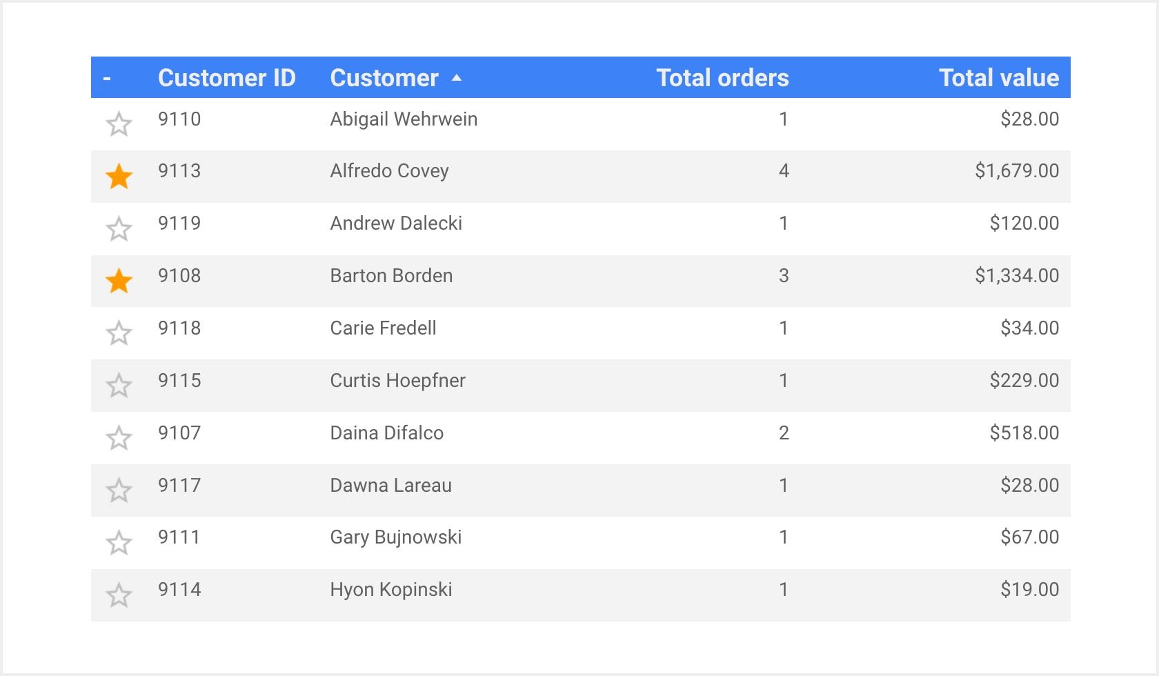
Field: 'Total value' is a Currency field, and contains values like: 28, 1679, 120 ...
Icons: star, star_border.
Condition:
IMAGE(
  CASE
    WHEN Total value > 1000 THEN 'https://example.com/star.png'
    ELSE 'https://example.com/star_border.png'
  END
)
Replace https://example.com with the address decided in Step 1.
Example 3: Rating
Using stars to illustrate product review scores:
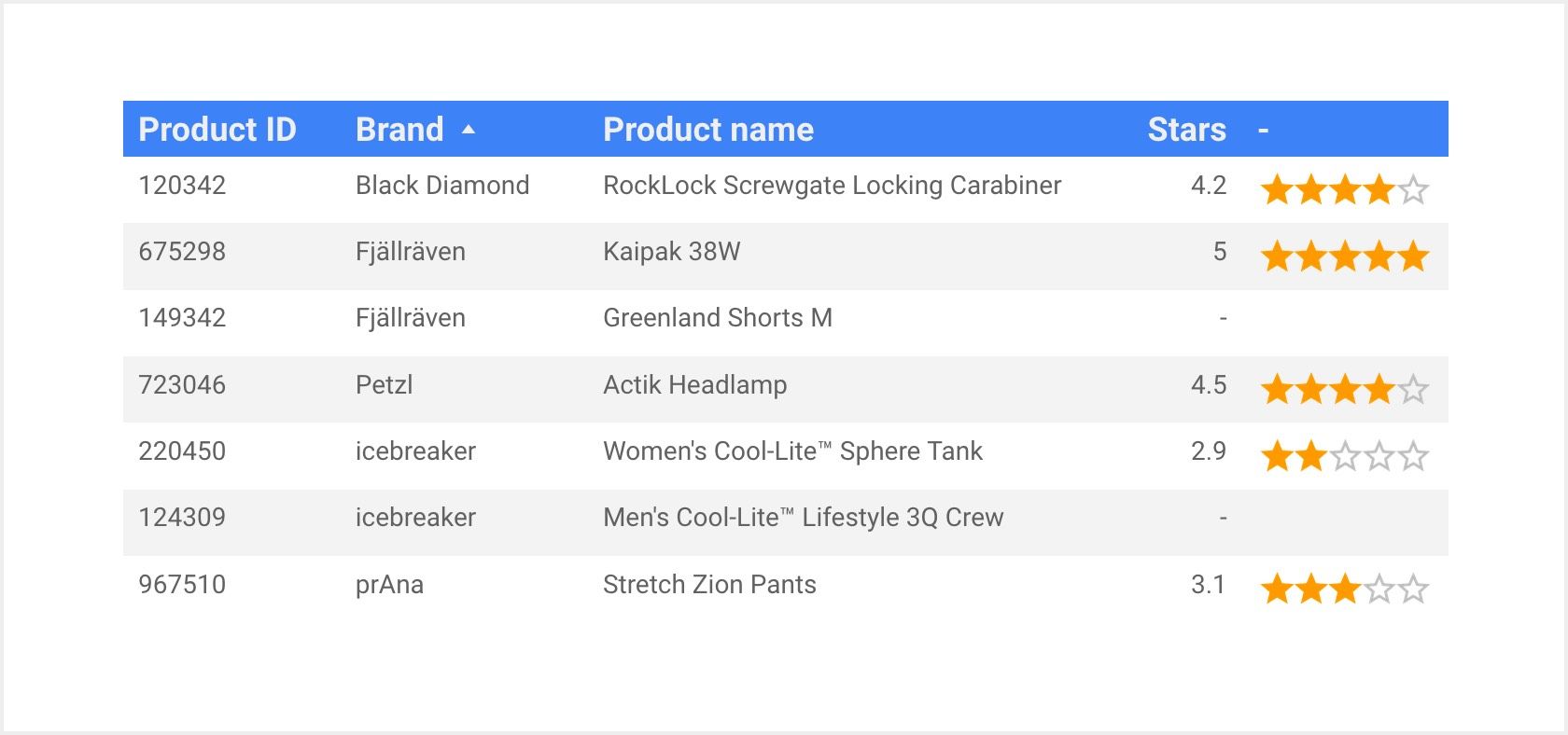
Field: 'Stars' is a Number field, going from 0 to 5. It contains values like: 4.2, 5, 2.9. It can be NULL when a product has no reviews.
Icons: stars_0, stars_1, stars_2, stars_3, stars_4 , stars_5, stars_null.
Condition:
IMAGE(
  CASE
    WHEN Stars = 5 THEN 'https://example.com/stars_5.png'
    WHEN Stars >= 4 THEN 'https://example.com/stars_4.png'
    WHEN Stars >= 3 THEN 'https://example.com/stars_3.png'
    WHEN Stars >= 2 THEN 'https://example.com/stars_2.png'
    WHEN Stars >= 1 THEN 'https://example.com/stars_1.png'
    WHEN Stars >= 0 THEN 'https://example.com/stars_0.png'
    ELSE 'https://example.com/stars_null.png'
  END
)
Replace https://example.com with the address decided in Step 1.
Example 4: Customer satisfaction
Using a face icon to represent the satisfaction of customers who replied to a survey:
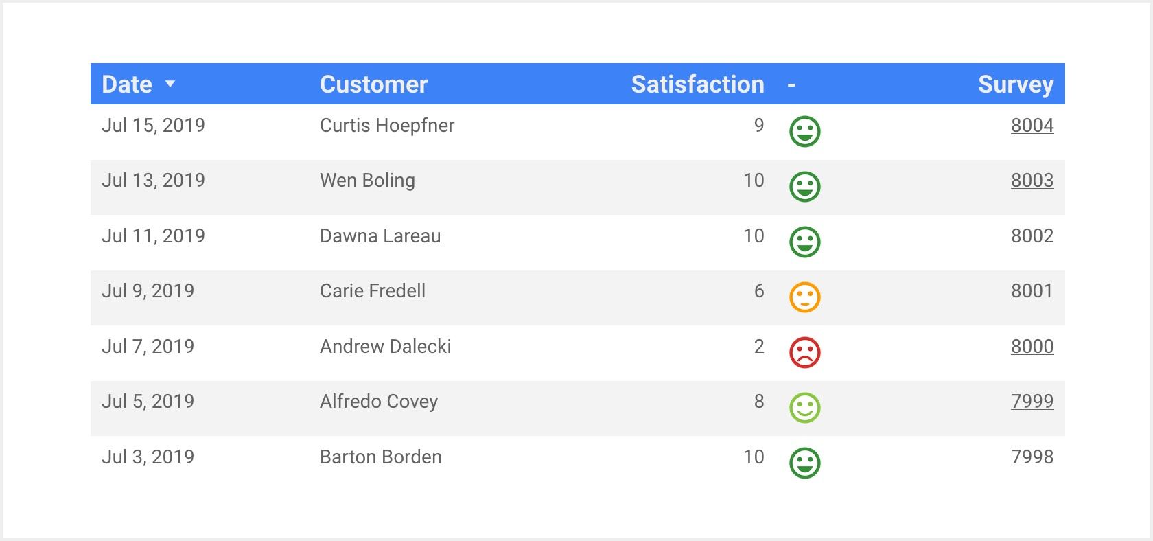
Field: 'Satisfaction' is a Number field, going from 0 to 10.
Icons: sentiment_very_satisfied, sentiment_satisfied_alt, sentiment_satisfied, sentiment_dissatisfied, sentiment_very_dissatisfied.
Condition:
IMAGE(
  CASE
    WHEN Satisfaction >= 9 THEN 'https://example.com/sentiment_very_satisfied.png'
    WHEN Satisfaction >= 7 THEN 'https://example.com/sentiment_satisfied_alt.png'
    WHEN Satisfaction >= 5 THEN 'https://example.com/sentiment_satisfied.png'
    WHEN Satisfaction >= 3 THEN 'https://example.com/sentiment_dissatisfied.png'
    ELSE 'https://example.com/sentiment_very_dissatisfied.png'
  END
)
Replace https://example.com with the address decided in Step 1.
Example 5: Error / Warning
Using a sign to indicate when a product has low stock, or is out of stock:
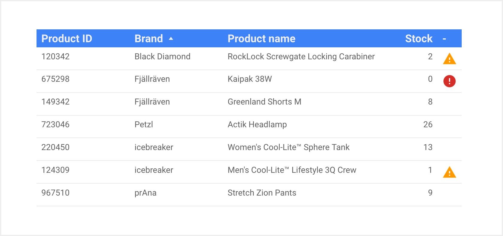
Field: 'Stock' is a Number field. It contains values like: 2, 0, 8, 26 ...
Icons: error, warning, transparent.
Condition:
IMAGE(
  CASE
    WHEN Stock = 0 THEN 'https://example.com/error.png'
    WHEN Stock < 3 THEN 'https://example.com/warning.png'
    ELSE 'https://example.com/transparent.png'
  END
)
Replace https://example.com with the address decided in Step 1.
Did you know ?
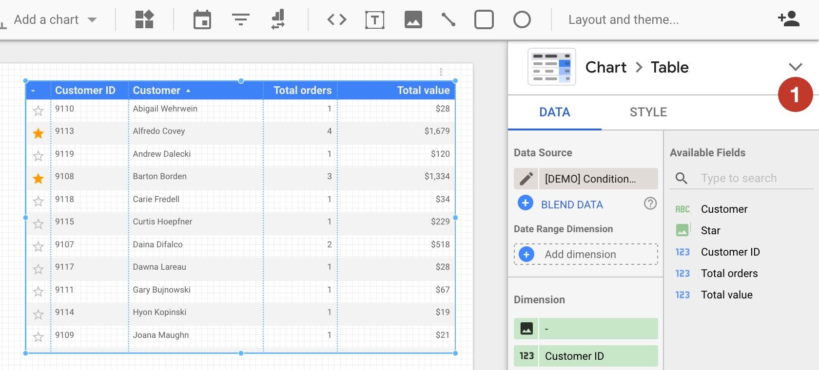
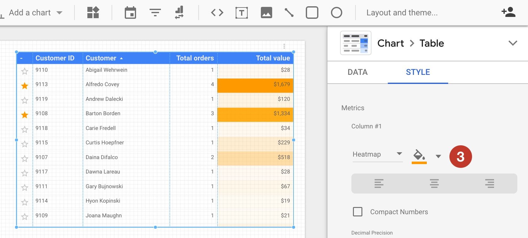
You can combine this technique with a heatmap. Here is an an example:
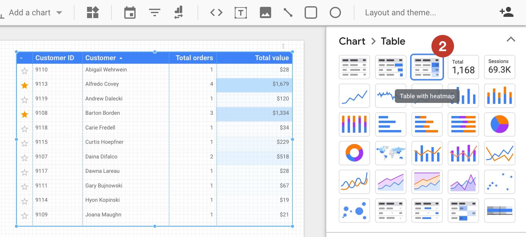
To activate the heatmap, click the arrow next to your chart's type (1):
Select "Table with heatmap" (2):
Then finally pick a color to use for the gradient in the style tab (3):
Conclusion
We hope that "real" conditional formatting will soon be available in Data Studio. The corresponding feature in Google's issue tracker looks assigned, so the team must be working on it.
Until then, we hope that our solution helps. If you need more icons, let us know!
Note about column orders
Added on September 27, 2019
Some readers asked how our examples can have images displayed on the right of all other columns:
We were able to get this result by using dimensions instead of metrics:
... and by aligning the contents of these columns to the right: